A business card has about two seconds to make its case, yet most tutorials either drown you in tool menus or skip the print-ready requirements that matter at the printer. The real gap across this set of videos is bleed and safe-zone setup: get those wrong and your cards come back with white edges or clipped text. Knowing the design principles and knowing how to hand files to a printer are two different skills, and the best videos here cover both.
Short verdict
Start with the Visme video: it is the only one here that works through what to avoid and why before covering the positive steps, and it ends with a practical comparison of print options. Once you have the principles, the Satori Graphics six-rules video is a tight checklist — 300 ppi, CMYK, 5 mm bleed, 5 mm margins, hierarchy — short enough to revisit before sending any file to print. If you are working in Canva specifically, the official Canva tutorial handles bleed and the danger-zone check inside the tool itself and is the clearest Canva walkthrough available here.
The ranking
1
Best overall
How to Design a Business Card | Do's and Don'ts for Business Card Design
Visme · 11:20 · Jul 2020
Presented by Mike Ploger of Visme, this 11-minute video is structured around two phases: what not to do (boring layouts, confusing visuals, inappropriate photos) and what to do (strong first impression, clean hierarchy, balance, finding your uniqueness). It closes with a comparison of local print shops versus online services such as Vistaprint.
Why it ranks here: It is the only video in this set to lead with negative examples before positive ones, which makes the principles stick. The point at 4:36 — you have about two seconds to make a strong first impression — grounds the entire design section in a concrete constraint rather than abstract advice. The printing section from 9:13 onward is genuinely useful for beginners who have never spoken to a print shop. Visme is the tool being promoted, but the design advice holds independently of it.
~11 min · beginner · no design software required
2
Best quick technical reference
6 Golden Rules For Business Card Design (QUICK FIRE TIPS)
Satori Graphics · 5:32 · Jun 2019
Tom of Satori Graphics runs through six rules in just over five minutes: a consistent theme front and back, legible text size tested by test-printing, 300 ppi and CMYK colour mode, 5 mm bleed, 5 mm safety margin, and typographic hierarchy. Each rule is explained in under a minute, and the advice applies to any design tool.
Why it ranks here: Where other videos mention bleed in passing, this one explains why it exists at 2:29: so the printer can cut multiple cards cleanly without leaving white gaps. The margins point at 3:00 makes the same case — text right up to the cut edge looks untidy and risks being clipped. At six minutes the video is short enough to return to as a checklist. A commenter summarised all six rules in the comment section, which shows how clear the structure is.
~6 min · beginner–intermediate · tool-agnostic
3
Best for depth
Designing A Business Card That Doesn't Suck! (6 Pro Tips)
Satori Graphics · 7:43 · Jan 2021
A second Satori Graphics video that goes further into professional workflow: document setup with built-in bleeds in Illustrator or InDesign, font legibility at small sizes, the purpose of negative space, standard card dimensions by country (3.5 × 2 in for the US, 88 × 55 mm for the UK at 2:55), and back-of-card strategy. It uses a gaze-analysis tool to test visual hierarchy on a real mock-up before print.
Why it ranks here: The gaze-sequence test at 5:04 is the most concrete hierarchy-checking method in this entire pack. Rather than telling you to 'use hierarchy', the video shows a mock-up being analysed and identifies exactly where attention lands and where the call to action underperforms. The country-specific sizing detail at 2:55 is absent from most tutorials. Use this as a companion to the six-rules video once you understand the basics.
~8 min · intermediate · Adobe Illustrator or InDesign recommended
4
Best for Canva users
4. Designing your Business Card in Canva | Skills
Canva · 4:33 · Oct 2021
An official Canva tutorial that covers choosing and editing a template, adjusting typeface and colour palette, building hierarchy through font weight and case changes, and preparing for print — including how to add bleed and use Canva's built-in danger-zone check to confirm text and elements sit safely inside the trim area. The minimum text size for a business card is given as 6 pt at 3:09.
Why it ranks here: Being produced by Canva itself, the tool walkthrough is accurate. The hierarchy tip at 2:42–2:55 — switching a name from bold to regular and a title from all caps to mixed case — is specific and immediately replicable. The bleed and danger-zone workflow at 4:03–4:19 is the clearest explanation of Canva's print safety features in this set. Watch this before the StartupWise Canva tutorial, which covers the same ground less precisely.
~4.5 min · beginner · Canva account required
5
Best for strategy before design
5 Tips to Create the Perfect Business Card | How To Design Professional Business Cards
Real Men Real Style · 11:01 · Sep 2014
Antonio of Real Men Real Style focuses on five principles that sit upstream of visual design: understanding the purpose your card needs to serve, keeping information simple and readable, ensuring all details are accurate, keeping presentation professional, and carrying enough cards. The video uses personal anecdotes from networking events to illustrate each point.
Why it ranks here: Most design tutorials assume you already know what information to include and why. This one asks those questions first, which changes how you approach the layout. The accuracy point at 5:18 — do not hand out a card with a crossed-out number or outdated company name — is mundane but often ignored. It does not cover print-technical requirements at all, so pair it with the Satori six-rules video for a complete picture.
~11 min · beginner · no software needed
6
Best if Microsoft Word is your only option
Printing Business Cards in Word | Video Tutorial
shmoggo · 3:49 · Jul 2012
A brisk 3-minute walkthrough of building a 2×5 table in Word, setting row height to 2 in and column width to 3.5 in, applying centre alignment and a background colour via the shading option, and printing. The presenter opens by saying Word is a last resort — 'only use Word if you don't have any other options because it's very limited in printing' 0:03.
Why it ranks here: The candour at 0:03 is rare and useful: you immediately understand the ceiling. The copy-paste alignment problem at 2:57 is acknowledged rather than hidden, and the fix is shown. Commenters confirm it works for quick jobs such as a church project or a jewellery business. No bleed, no CMYK, no press-ready export — the output is home-printer quality only.
~4 min · beginner · Microsoft Word only
7
For CorelDraw users
How to Create Business Cards in CorelDraw
Photoshop Design and Photo editing Tutorials from HowTech · 4:39 · Mar 2013
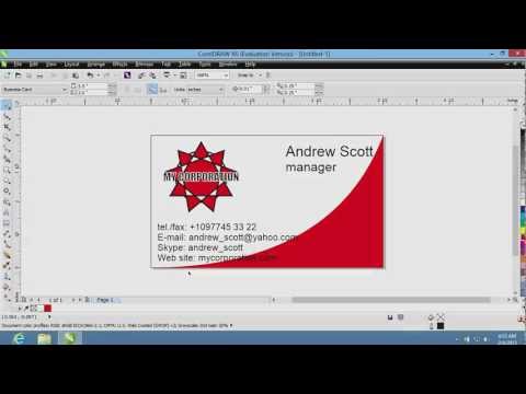
A HowTech tutorial that selects the business card preset in CorelDraw, adds text blocks for name and contact details, builds a simple logo using the ellipse and complex star tools, aligns elements with keyboard shortcuts (C and E keys), and adjusts stroke weight and colour. The preset handles card sizing automatically, removing one common beginner error.
Why it ranks here: The keyboard alignment shortcuts at 1:56–2:04 are a genuine time-saver, and the preset removes the need to look up standard dimensions. The video is from 2013 but the CorelDraw workflow remains accurate. A commenter asks 'No bleed areas?' — and the tutorial never addresses this, which is a meaningful omission for anyone sending the file to a commercial printer.
~4.5 min · beginner · CorelDraw required
8
Best for Illustrator document setup
How to setup Business card Document in Adobe Illustrator | Business card size | How to make Guides
Fatimah Graphics · 6:06 · Sep 2020
Fatimah Graphics walks through creating a new Illustrator document from scratch for a two-sided business card: choosing CMYK colour mode, setting 300 ppi, entering the standard 3.5 × 2 in dimensions, adding 0.125 in bleed on all sides, and building a safe-zone guide at a further 0.125 in inside the trim edge. The video covers document setup only and does not include card design or typography.
Why it ranks here: It is the most thorough technical setup tutorial in this pack. The explanation at 0:47 of why CMYK matters for print — and the contrast with RGB web profiles shown at 1:06 — is clearer than anything in the broader design videos. The bleed at 3:04 and safe-zone construction at 4:09 are shown step by step. Use this as a setup reference before one of the full design tutorials.
~6 min · beginner–intermediate · Adobe Illustrator required